Kiran Kulkarni
In 2009, an external company used PayPal API's and created an activity feed for users to check their transactions. By the start of 2012, PayPal made its activity available for all its consumers and merchants. Since then, there has been no change in the UI until it showed up on the mobile app. The use-cases grew to add new complexities that made the experience slow and complex to use.
I initiated this project to redesign the Activity experience for one of the largest digital payment solution provider.
To comply with my non-disclosure agreement, I have omitted and obfuscated confidential information in this case study. All information in this case study is my own and does not necessarily reflect the views of PayPal
REIMAGINING THE ACTIVITY FEED

CHALLENGE
Establishing a meaningful connection between ‘transactor’ and ‘transaction’ is a fundamental requirement of a payment application today.
Currently, users track, locate, take actions using activity. We discovered some friction, fear, and anxiety.
Customers want to feel confident, informed and better positioned to do their jobs better using activity.
MY ROLE
I am leading the design for the activity redesign with one designer. I collaborated with researchers, product managers of Home page, Bill pay, Credit, Settings, CIP, P2P.
I have presented this idea to the leadership committee and negotiating resources to build this experience
The project is currently in the concept testing phase and planned to go live in Q1-2, 2020
Stages of Product Design
Foundational
Segment
research
Problem Discovery
Problem Distillation
Solution discovery
Iterative development
Qualitative Research
20 one-one interview
4 Segment based FGDs
Listening to 300 customer calls
VOC data
Experiments with component (AB tests)
Bi-Weekly Checkins (Qual feedback)
Design Sprint
Layout Explorations
Component Explorations
Journey Maps
Master concepts
User testing
Detail Design
Hand off

What do users think of activity?


Segment needs varies
CASUAL SELLER
I see the money in and my customers. I track my earnings, payment, shipping status, and items I sell. I need quick access to see my business with my customers.


SUPER SHOPPER
I want to keep track of my spends, best deals and find ways to save money. Its currently not easy. Refunds, shipping status are good to have.
P2P User
I send money to my family abroad. I want to keep track of my money with my friends and family so that i can plan better.
Current Experience


INSIGHTS FROM GLOBAL IA TESTS
We conducted a series of tests from open, closed card sorts, tree tests, click tests to understand the user's mental model that helps us to look at Information architecture of PayPal overall. Over 300 participants helped us to give their feedback both remotely and in the lab.
We found out that people tend to visit activity not only to track, locate or take actions on transactions but for many other needs. They come to activity to review their Credit transactions, view saved shopping cart, see online offers, check PayPal balance and credit balance
Concept map

"How might we help customer segments understand their transactions better, have more control to do their jobs better across PayPal ?"
RE-FRAMING THE PROBLEM
The current structure of activity feed creates comprehension issues, makes cross-verification difficult, not tuned for segment-specific needs, cannot scale to PayPal inc. products or help customers in their routine jobs.
Our proposal was a re-design to address the above issues
SOLUTION DISCOVERY
I organized a DESIGN SPRINT workshop with 8 ideators, 4 experts, 2 decision-makers. The team composed of engineers, product managers, designers, and program management.


Ideation resulted in a framework creation that included ideas around bill pay, cross-sell, rich feed, PayPal single account management across all PayPal products, segment specific solutions, Dashboards around spend, earn, offers, Social transactions that will enable customers daily jobs
Exploring layouts, grids, spaces
We explored various grids, layout possibilities to understand space constraints required to present transaction feed across web and mobile


Initial explorations revolved around bringing the parts of the design together and see how it can be organized around the constraints of space, content, problems we listed and mediums
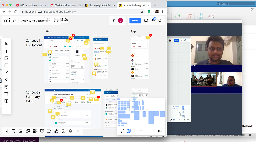
Stage 1 - Design explorations
In the above concept, we can see used balance views to solve cross verification, tabs to move around PayPal inc. products, upfront CTAs on transactions to fast forward funds, adding direct payments


In the above concept, we can think of rich feed within the transaction with deep links to profiles, upfront rich media, actions, fast access to funds in progress
Peer reviews, getting details right
I organized a real-time review session with leaders who were primarily stationed in the United States, to get weekly feedback on the progress we made
Mapping the activity touch points
By mapping the activity touchpoints, we sketched the experience goals that add value overall for users time with the touchpoint

Current explorations
Just view the activity and now plan your earnings, savings, social connections, bill payments, cross-check with your balance, see deep history of the transaction, ETA's to take immediate actions which are now easily discoverable to control your funds. Reduce anxiety and make it easier, simpler to work with your money the way you want it to be
By mapping the activity touchpoints, we sketched the experience goals that add value overall for users time with the touchpoint. This is work in progress.

We are proposing new navigation to make it easier to move across various PayPal inc. products, view balances upfront and can quickly move to transactions that need a nudge to fast forward the funds

Rich feed notifications, feed design will show actions and social activity in the context of the transaction. For non-active users, the banner space will be used to onboard him with PayPal experiences. Improved search will enable the quick location of the transaction.
